Victorian Rear Extension: from jumble to open

Imagine you've finally found your ideal location, the Down Conservation area in Bristol, and your ideal home, a three-storey semi-detached Victorian house with high ceilings and a private south-facing garden, perfect for the kids.
From the outside, it looks a little run-down but nothing a bit of work can't solve. Now, you open the door and see the full extent of the project (don’t run, it’ll be worth it!). A house that hasn’t been touched for years, needing more than just a little TLC…
Our clients could have decided to wait, find a house requiring less work or given up altogether.

But the potential of the space was simply too good to pass on.
They called upon DHV Architects who gladly took on the challenge to transform a jumble of rooms into a large open-plan family home. You may already know we work in close partnership with the Bristol-based architecture firm. This allows us, perhaps a little unusually compared to traditional interior designers, to develop a complete vision for the client and suggest any modifications that can be fed back at the planning stage, avoiding potential costly changes further down the line.
With two children, the clients were keen to create a large sociable room suitable for spending time as a family and entertaining friends. A few layouts were considered before settling on a full-width rear extension with an additional utility space connecting the kitchen to the door, providing storage for muddy boots, a utility sink, and laundry space.

Keeping the house connected to the enclosed garden was a key element of the design. Rear extensions by default will eat into the green space. You might want to consider the orientation of the plot to influence your decision:
- Which way is the garden facing?
- Do we want to enjoy the morning/afternoon/evening sun?
- Is it overlooked?
- Will there be space for a patio/grass patch/vegetable garden?
In some cases, you may want to reduce the depth of your extension, opting for a half-width arranged in an L-shape. It all depends on the inside flow and how well it connects to the outside. As a rule, we always provide a couple of layouts to review.

There’s also the budget to consider. A smaller extension is not necessarily cheaper to build, however, a larger size has cost repercussions on the internal space. A large kitchen will require more units, the furnishing costs may also be higher as you may require a large three or four-seater sofa to balance the space. Lots of large glazing also mean that you might need more fabric for curtains, leading to more costs.
Don’t let this discourage you though. We work to budgets as a whole, and we have plenty of ways to save costs in certain areas. If in doubt, it’s always worth asking for advice.
Inspiration for the scheme
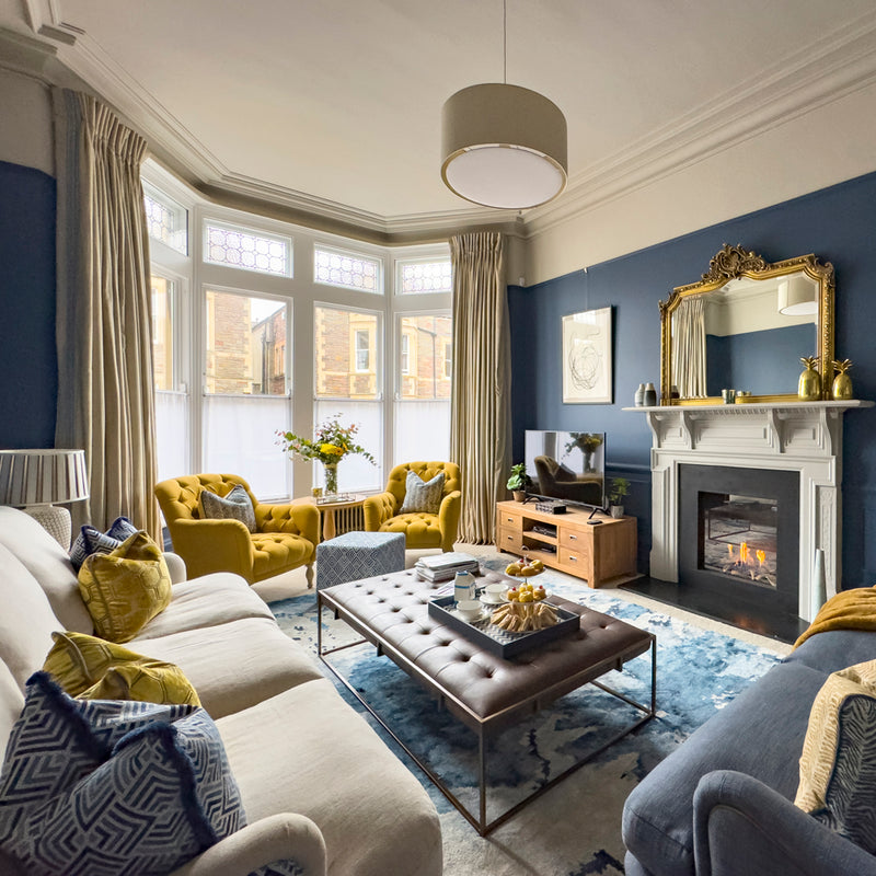
The clients were keen for the space to reflect their personalities and tell their stories in subtle ways. The space is visually divided into four zones. The main inspiration for the colour scheme is rooted in the beautiful Cornish scenery, where the owner grew up. She was particularly drawn to blue and natural wood accents, reminiscent of the sea and the coastal landscape she loves.

We opted for the Hoxton tile in Ocean Blue from Mandarin Stone. We used this tile in other colourways previously and knew the subtle difference in colour pigmentation would add depth to the kitchen. The tile is also non-rectified. This means that each tile is slightly different with an uneven surface which is perfect to create a natural look.

The opposite wall is painted in Oval Room Blue from Farrow & Ball. We loved the slightly aged feel of this shade to contrast with the modern design of the extension. It allowed us to draw a bridge between the original property and its contemporary addition.

The other part of the brief was to incorporate the owner’s link to engineering. His brief was to provide a clean, legible and honest design.
At this point, we should raise a warning flag:
"Combining different influences into one open space can look great when the whole remains coherent".
The link can be through colour, materials, patterns but we feel there should be a link. It’s a little different when designing a single-use space.
For example, we designed a living room with a strong Art Deco vibe while the rest of the house was Edwardian (the strong colour did still link the spaces though!), you can discover the project here. However, the difference resides in seeing all influences at one time, all together in one space which can be overwhelming and sometimes confusing.
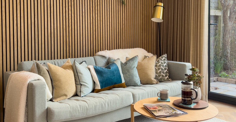
Details: Wood Slat Panelling and Feature Light
Our interpretation of the brief therefore translated into a discreet nod to engineering, embedded into the materials and the clean lines. We opted to leave the steel beam exposed and add wood slat panelling behind the sofa, repeated onto the kitchen island to provide a flow.  The light pendant, from Tom Raffield Cornish designer, further bridges the gap between both influences.

The new space would be filled with light from the large south-facing sliding doors. This posed the question of curtains that often gets filled in the 'to think about later' box. We always propose curtains and window dressing options as part of our design development as:
"large openings and how they are framed influence the overall look and feel of the space and count just as much visually as other key structural elements."
As mentioned above, curtains can be costly depending on the fabric and the meterage required to dress the window. We usually recommend a simple wave curtain, not only are they visually pleasing, they are also cost-effective to make. For this project, we opted for a double-width fabric from Kobe to provide an extra saving on fabric costs, with a sheer finish that would filter the light when required.

To prevent both ourselves and the clients going off piste, we referred back to the moodboards and visuals throughout. Although the visuals evolve along the design process, the moodboard typically stays the same, it’s a beacon to bring us back to that first concept. You can find out more about our process here.
Interested in creating a similar project? Get inspired by our project storyboard and find out more about our design process.
Check out our latest projects for more inspiration and book a consultation to discuss your home project.
![]()
![]()
More Posts
-
![Unlocking potential: a new build home gets a stylish and clever makeover]()

Unlocking potential...
Moving into a new home goes beyond just the look – it's about functionality too. Yet, many new builds lack essential elements such as storage and s...
Read More -
![Period Family Home Refresh, Henleaze]()

Period Family Home ...
With its welcoming atmosphere, the picturesque charm of the tree-lined street, and the abundance of independent foodies’ places, Henleaze is one o...
Read More -
![Colourful Interiors for a Period Home, Clifton]()
Colourful Interiors...
The homeowners contacted us to help them with their formal living room, living room snug and cloakroom renovation. They were slowly working through...
Read More


Comments
0 Comments
Leave a Comment