Terraced Victorian Renovation: a tranquil retreat

Situated in bustling, popular Bishopston in Bristol, this terraced Victorian house was brimming with potential. When the owners bought it, they saw its tall ceilings, period features and secluded rear garden, an ideal family home a stone's throw away from Gloucester Road and its independent shops.
Read the Houzz feature on this property: Houzz Tour: A Victorian House Brought Impressively Up to Date
A top to bottom redesign
As is often the case with Victorian properties, a full renovation was required. The owners were prepared to embark on this journey but they knew that redesigning an entire three-storey house whilst working and managing family life wouldn’t be a small job. They hired an architect to draw plans to open the ground floor, add windows and improve the layout and enlisted our help to plan the interior.
Armed with a floor plan and a fairly good idea of what they wanted to achieve, the couple’s biggest challenge was to balance the budget to cover the necessary building upgrades while creating the look and feel they desired for the interior. A big advantage in this project was that we were called in before construction started, so we were able to discuss which elements the couple would have to compromise on to keep to their renovation budget. We applied a pain versus gain approach to review the plan. We agreed that knocking the wall down between the living and dining room was an integral part of the new layout as would the removal of the dining room chimney breast but we avoided altering the staircases as they would eat a big chunk of the budget.
As the whole house was very draughty and inefficient, the owners wanted to upgrade the windows and install an air source heat pump. This is a big undertaking requiring expert advice, so they worked with a local gas and heating engineer whom we’d worked with on similar properties. Working closely with the building contractor, they planned where the system would go and the required insulation for the external walls, floors, and roof to make their home more efficient. The addition of underfloor heating on the ground floor also removed the need for wall-mounted radiators in the main living areas. With the structural elements agreed and the architectural plan amended, we could now start developing the interior scheme.
Planning the interior: where to start?
The common pitfall is to rush into furniture layout. However, understanding the spatial layout first allows for key details to be ironed out. Top of the list is the kitchen. We tend to plan this space first as it usually has the longest lead time and is a major budget item. It also requires a lot of consideration and attention to get all the space and configuration working for your needs. Our top tip is to decide early on whether your kitchen will be made bespoke to fit the space or whether you’ll have standard units that will be fitted into the usable space. Budget is a key consideration as to which route to take as well as the complexity of your space.
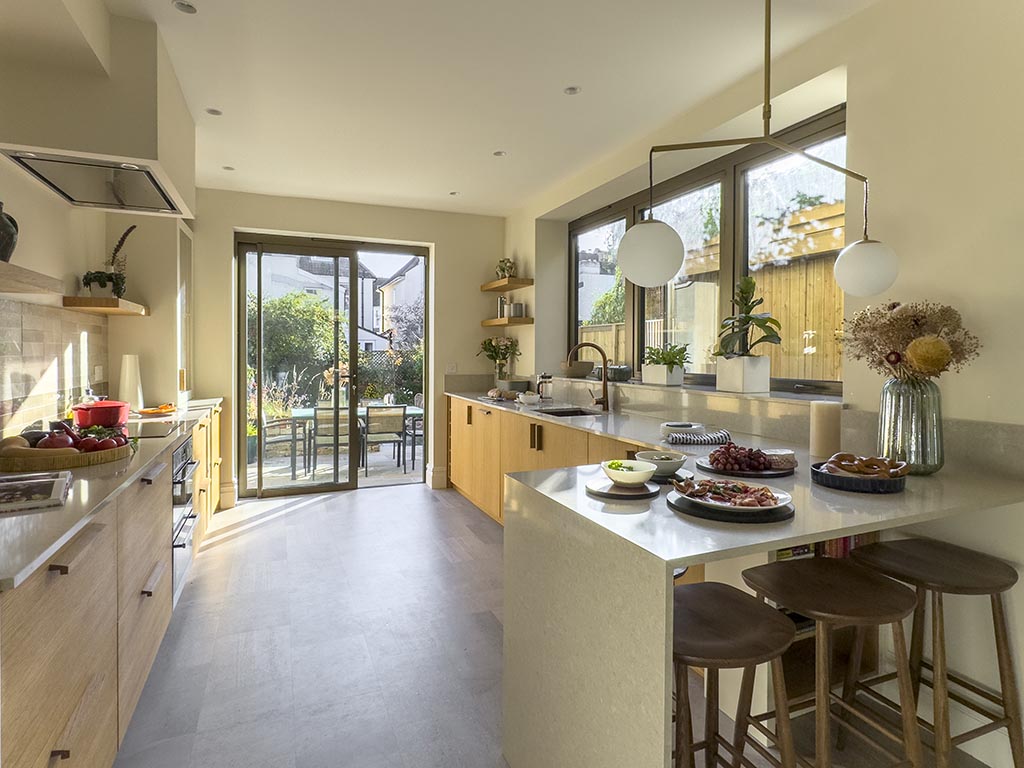
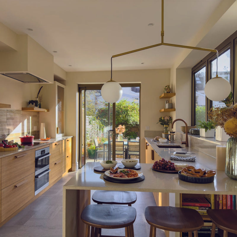
In this project, the kitchen was part of a previous half-width rear extension and was fairly narrow. Its size did not allow for a kitchen island but the couple were keen not to extend it further to retain the garden area. The layout was reworked to include new sliding doors on the back wall to step into the garden and a large window that would occupy most of the side wall. This new configuration created a galley-type layout. With units on either side walls, we advised the owners to reduce the sliding door size to retain the feeling of space. We created a concept design to show the new layout that included a peninsula with a waterfall edge and the main elements such as sink, cooker, pantry, cupboards. The owners previously had a fitted kitchen and they’d had to compromise on some elements. This time around, they wanted to make sure they got exactly the right balance of worktop, display, and storage space so we put them in touch with one of our kitchen partners, Creative Storage & Kitchens, to create a bespoke kitchen. Working in tandem, we developed the materials and finishes, while the maker focussed on utilising every inch of the available space and crafted a kitchen that would last a lifetime; within the defined budget.

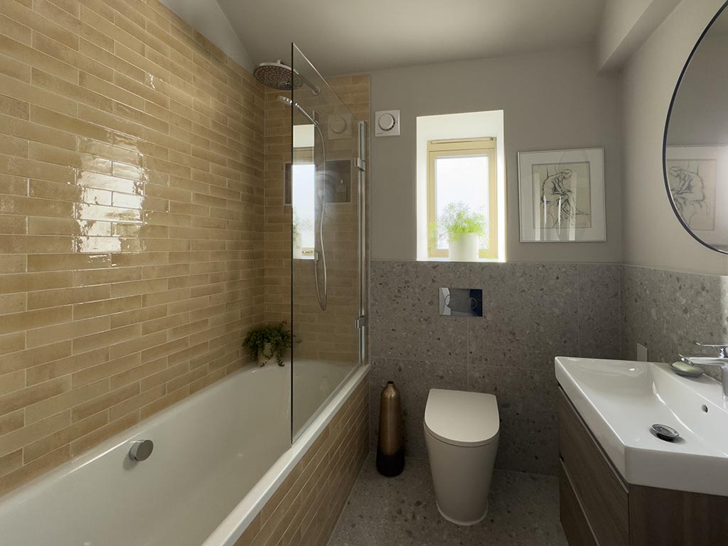
The family bathroom was another tricky space. At just over 5sqm, the wall had already been pushed back into the study and the hot water cylinder was clogging up the remaining space. The contractor, however, managed to move the cylinder in the loft, enabling us to retain a shower over the bath, key for the needs of the family and include a large basin. In small spaces, we always try to blur the edges of the room to make them appear bigger, so we developed a tiling scheme where the floor tiles flow up halfway up the wall. The loft bathroom was more generous in size and we kept the feeling of space with a large walk-in shower.
Creating a minimal but warm aesthetic
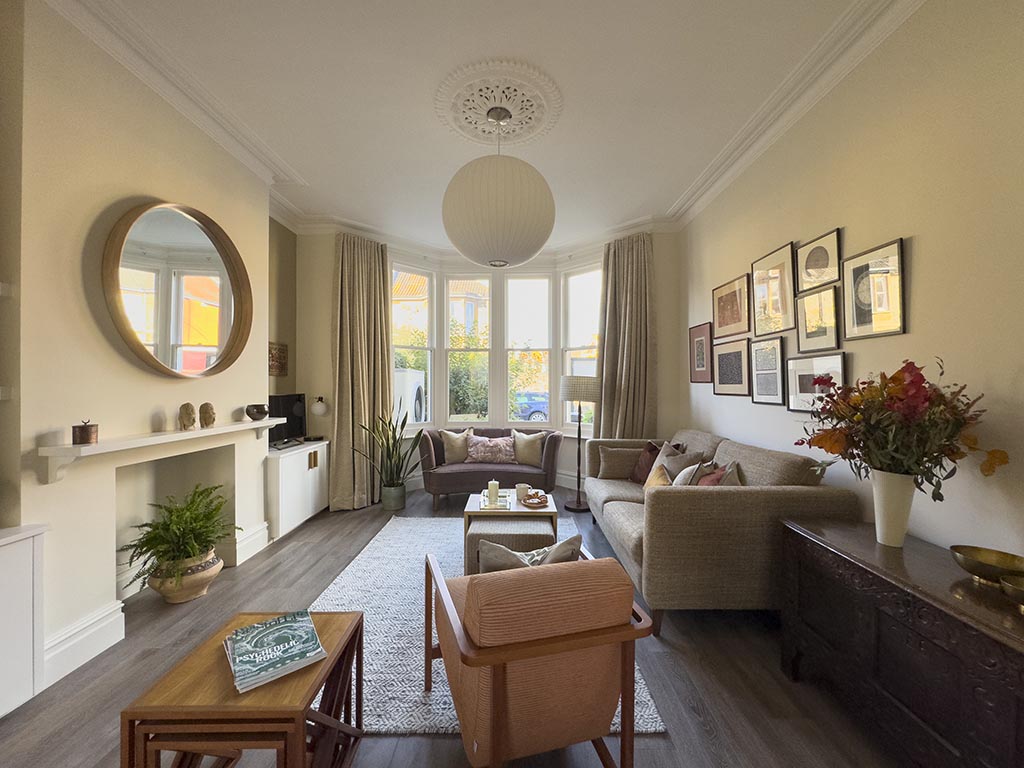
The owners asked us to create a contemporary, clutter-free aesthetic and incorporate cherished furniture pieces they’d collected over the years. With an Indian heritage, they were keen to incorporate warm and earthy colour such as terracotta, orange, and browns with pops of vibrant colours. Often minimal aesthetics evokes monochrome colours, cold and angular furniture. However, as this project shows, a minimal aesthetic can be created with almost any style. It is the overall calm vibe, free of clutter and visual distractions that creates the minimal look and feel, and its core resides in the careful balance of flow and thoughtful arrangement of textures and materials.
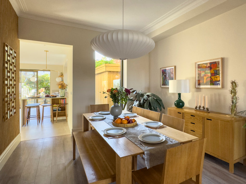
We always start by creating a colour palette for the flow areas within the whole house. It helps ensure the whole property feels cohesive, even if different rooms have their own individual colour palette and theme. . The orientation of the room and how the natural light will be is a consideration for the final colour choice but there’s no need to overthink it at the planning stage. We focussed on selecting tones we knew the owners liked and complemented them with texture and layering options for materials such as wallpapers, tiles, curtains, upholstery, , as it’s important to create depth in each space. One key element to nail the minimal brief was the flooring. After reviewing samples, we settled on a dark wood tone in large plank format that would be used throughout all the living areas, apart from the kitchen and family bathroom. This helped create spatial and visual continuity from the ground floor to the loft. The absence of entrance thresholds helped create a seamless flow from corridor to rooms. A small design detail with a major impact.
Open plan living: how to zone it?
With an open plan arrangement, zoning the space is crucial. The furniture is used to guide the movement, rather than hinder it and to help define the room’s function. With open plan living, there’s usually more than one function in the space too, so its important to group similar functions together. For example, the kitchen with a dining area are grouped together, the casual seating and TV area are grouped in another zone. Complementary colours, rugs and accessories help further define section and create interest in each.
For this project coherence and balance were key for the couple. They had a beautiful collection of ceramics and prints we suggested to showcase by keeping the walls neutral but complement the tones through upholstery, soft furnishings and an understated feature wallpaper. The larger wall in the dining room was perfect for creating movement and flow through to the kitchen. We selected a wallpaper from Casamance featuring eucalyptus leaves with exceptional depth and a variety of natural shades as an invitation to explore the garden beyond the kitchen.
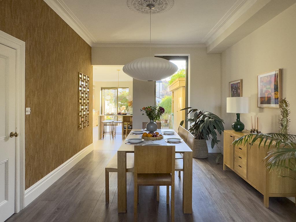
With one of the owners being a landscape architect, the connection to nature was a key element of the design brief. We incorporated another leafy pattern in the cloakroom with a dramatic black and white wallpaper. You can just catch a glimpse of it as you walk through the front door, creating that indoor-outdoor connection.
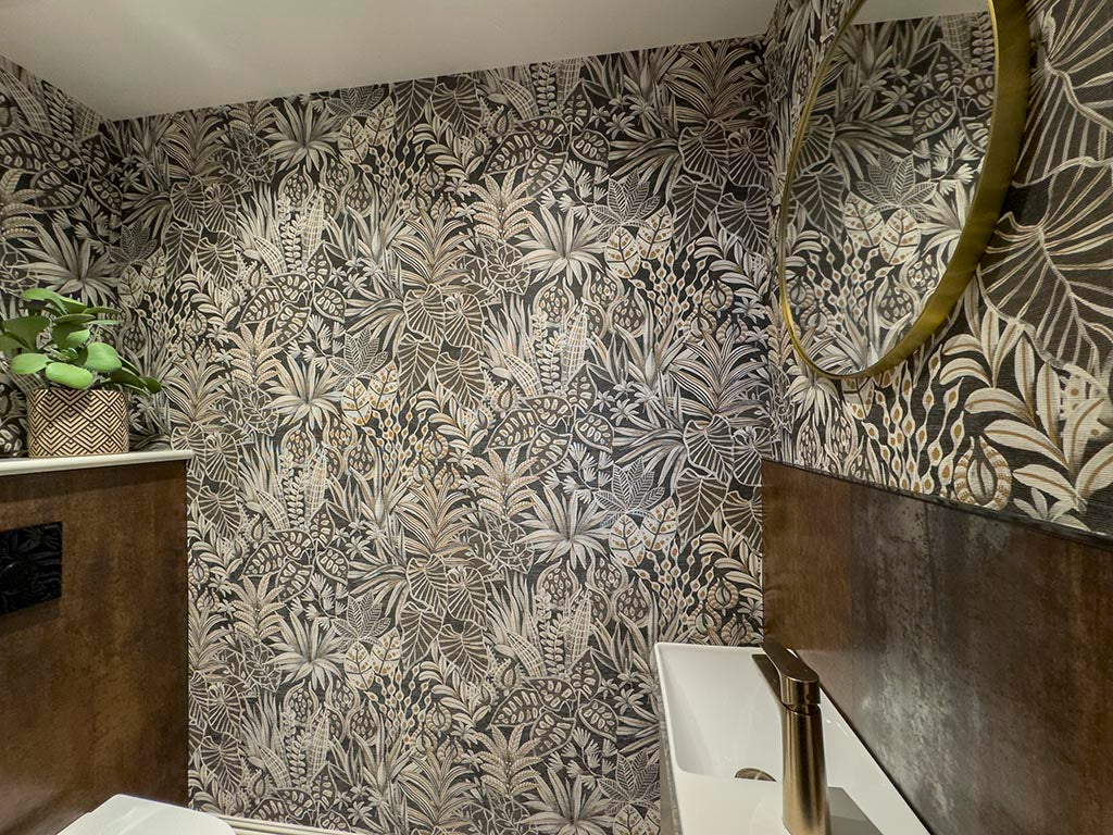 Cloakroom: Casamance wallpaper and Mandarin Stone Forge Oxide
We always suggest going bold in small spaces, especially cloakrooms, to create little pockets of interest in a whole house scheme.
Breathing new life in an old home
The original entrance hall door featured beautiful stained glass, a lick of paint and new hardware was all that was needed to create a welcoming feel as you enter the home. The ceiling roses were preserved and fitted with simple pendants. The picture and dado rails were removed which enabled us to appreciate the volume of the space created by the high ceilings. The gas fireplace was also removed and left open, with built-in units added in the chimney breast alcoves to provide handy storage and symmetry. The hallway, kitchen and bedrooms upstairs had original wooden floorboards, which were retained but covered with new Luxury Vinyl Tiles (LVT) flooring. It served two purposes. Firstly, the new flooring improved the heat efficiency and retention as the wooden boards had gaps, and it acted as a soundproofing barrier. With two adults working from home and two kids studying, peace and quiet were high up on the goals list.
 Entrance: stained glass and stair runner to create an impact
A picture-perfect finish
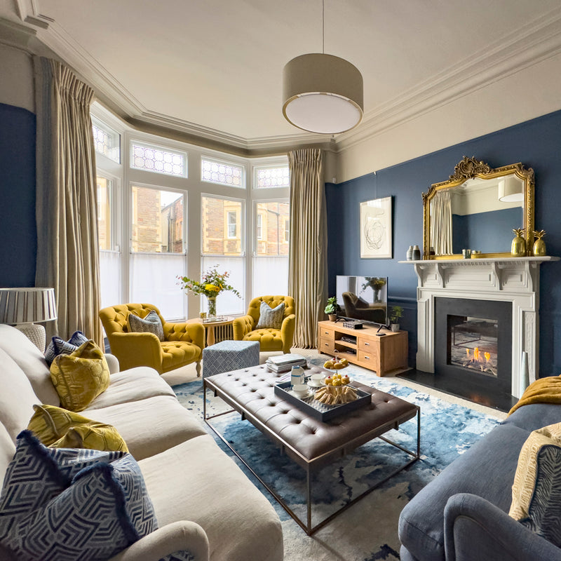
With big-ticket items such as sofas, curtains, and other furniture often coming last in a large renovation project, we always recommend ring-fencing an interior budget from the start. It certainly helped us support the couple to finish their home as we found creative ways to save costs in the bedrooms and utilise existing furniture and accessories. The existing sofa however was worn out and no longer fitted in the new layout, and neither did the coffee table. We proposed to create a bespoke arrangement. There’s a misconception that bespoke is ‘eye-wateringly’ expensive. However, we were able to stay within budget by tasking Sofa Magic, a Bristol-based independent upholsterer, with creating a two-seater sofa to fit the space snuggly. We sourced a beautiful textured fabric that would enhance the tones of the space and together defined the optimum sofa depth, height, length and even the cushion filling to suit the couple’s needs. The layout prevented us from creating a larger sofa so instead we gained more seating area by specifying narrow tapered arms. We gained a further two occasional seats for visiting family and friends by creating an ottoman and table combination.
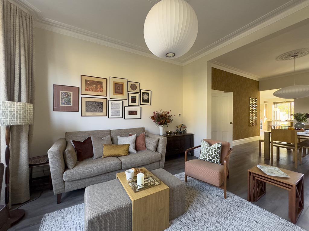 Living room: bespoke sofa and ottoman table in Casamance fabric.
As in all major renovation journeys, there were bumps along the way but the clients couldn’t be happier with the results. For us, the best part of our jobs and the loveliest compliment from the owners was that we ‘helped make a large project into a positive experience’.
Check out our latest projects for more inspiration and book a consultation to discuss your home project.
![]()
![]()
![]()
More Posts
-
![Unlocking potential: a new build home gets a stylish and clever makeover]()

Unlocking potential...
Moving into a new home goes beyond just the look – it's about functionality too. Yet, many new builds lack essential elements such as storage and s...
Read More -
![Period Family Home Refresh, Henleaze]()

Period Family Home ...
With its welcoming atmosphere, the picturesque charm of the tree-lined street, and the abundance of independent foodies’ places, Henleaze is one o...
Read More -
![Colourful Interiors for a Period Home, Clifton]()
Colourful Interiors...
The homeowners contacted us to help them with their formal living room, living room snug and cloakroom renovation. They were slowly working through...
Read More


Comments
0 Comments
Leave a Comment